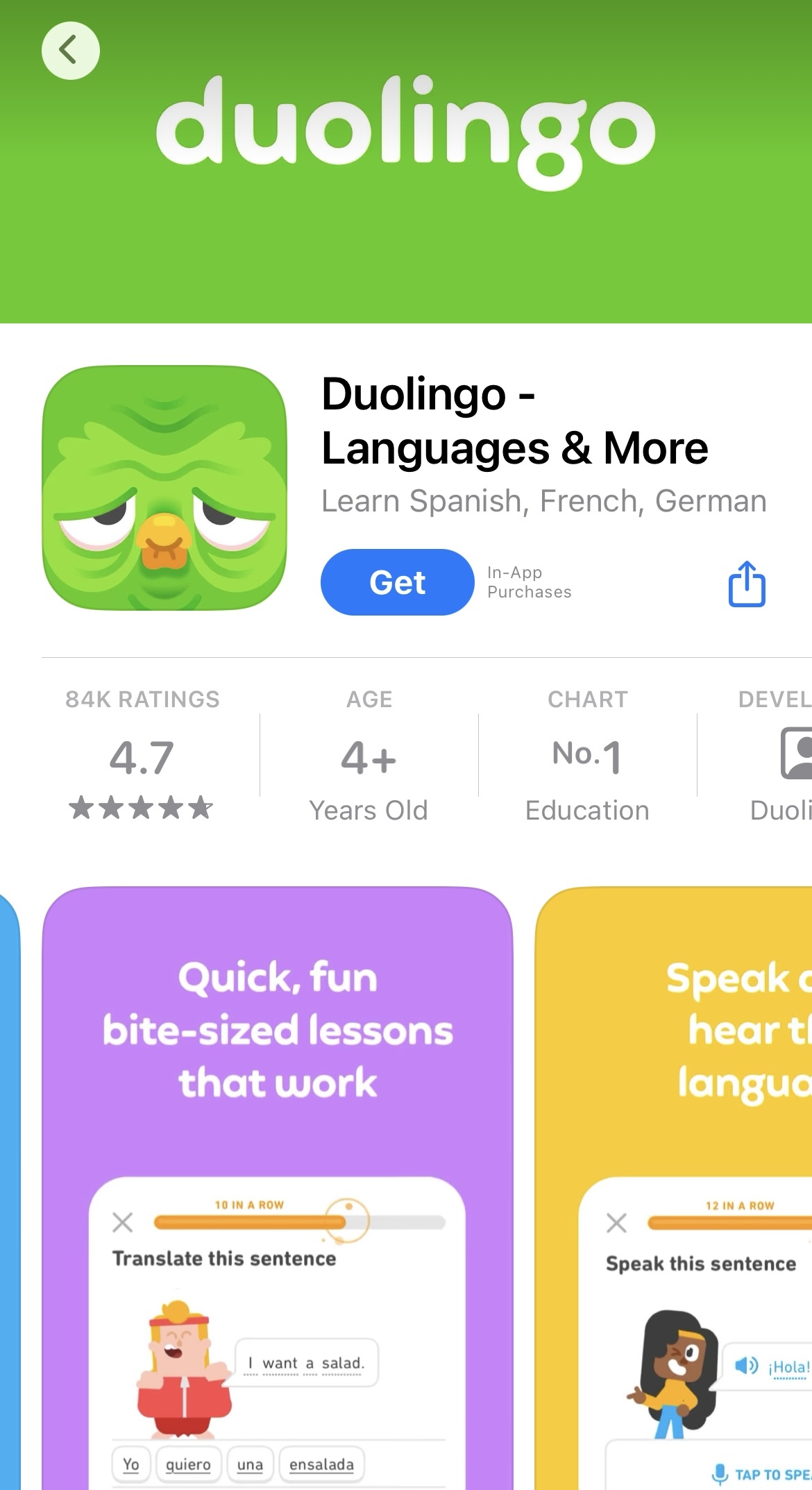
Changing the Duolingo icon to look sad, old, and wrinkled is a strategy to make users curious, so they open the app to see if there are new updates or content. In other words, Duo is only trying to get your attention.
This tactic is rooted in the psychological effect known as the “novelty effect,” where new stimuli can temporarily increase engagement and motivation. Snapchat similarly employs this strategy with the red dot and yellow dot on the Bitmoji.
Makes sense. My partner was showing it to me “see? It’s probably because I’ve got notifications muted” unmutes notifications, “no that isn’t it” then I suggested they complete a lesson to see if it changed and it still didn’t, so she put it away. Later I heard that the app notified her that two of her friends congratulated her for starting to again.
It’s a cute program, but wow does it hector people.


Attention grabbing apparently.
https://stealthoptional.com/apps/duolingo-icon-looks-sad-old/
It just reminded me how long it had been since I’d launched it so I just uninstalled it lmao
haha I did the same
God I hate marketing bullshit like this.
Sooo Duolingo is a tamagochi now
Yep. I figured this is what had happened and it definitely worked on me. 🙃
Yeah Duolingo uses the novelty effect a lot
deleted by creator
Oh, I didn’t know that.
Makes sense. My partner was showing it to me “see? It’s probably because I’ve got notifications muted” unmutes notifications, “no that isn’t it” then I suggested they complete a lesson to see if it changed and it still didn’t, so she put it away. Later I heard that the app notified her that two of her friends congratulated her for starting to again.
It’s a cute program, but wow does it hector people.