JackSparrow174@discuss.tchncs.de to Memes@lemmy.ml · 11 months agoWhat an evolution 🙄😒discuss.tchncs.deimagemessage-square29fedilinkarrow-up1425arrow-down1104
arrow-up1321arrow-down1imageWhat an evolution 🙄😒discuss.tchncs.deJackSparrow174@discuss.tchncs.de to Memes@lemmy.ml · 11 months agomessage-square29fedilink
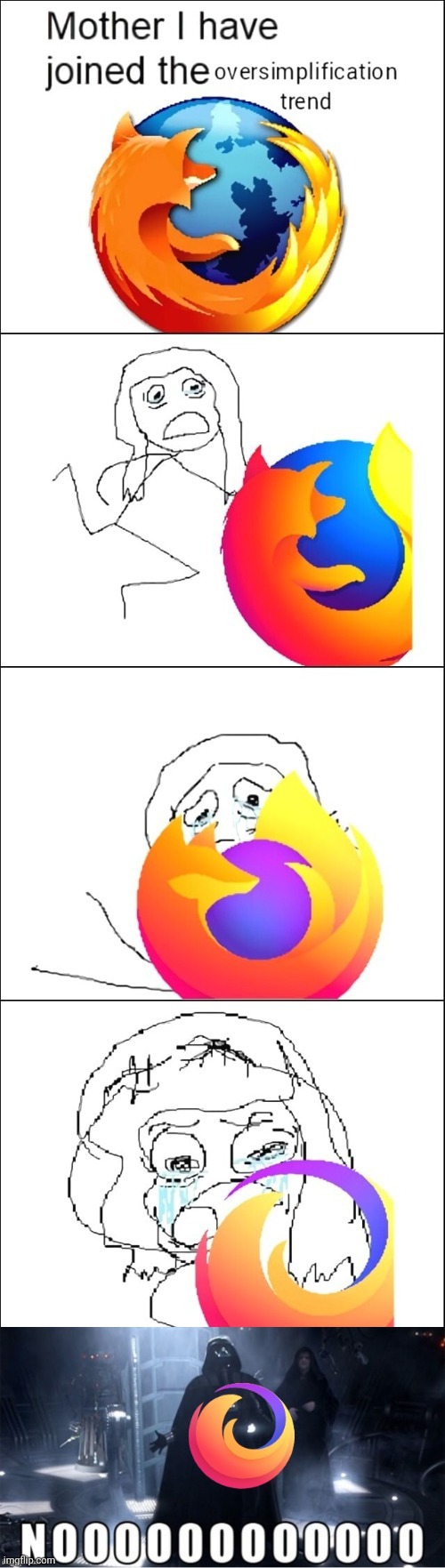
minus-squareKirbySSM@lemmy.worldlinkfedilinkEnglisharrow-up162·11 months agoThe last one is not the Firefox logo. It’s the logo for the “Firefox Brand” of products (Which includes Firefox, Firefox Monitor, etc.) Firefox the browser uses the second to last logo, and I honestly think it looks pretty good?
minus-squaremagnetosphere@kbin.sociallinkfedilinkarrow-up29·11 months agoThird panel? Yeah, that’s my favorite, too.
minus-squarelugal@sopuli.xyzlinkfedilinkarrow-up15arrow-down1·11 months agoI’m raised in a time were foxes had forelimbs but you zoomers don’t seem to know such basic biological facts. Jokes aside, I prefer the second but it’s obvious just my personal tast.
minus-squareclb92@feddit.dklinkfedilinkarrow-up8·edit-211 months ago I’m raised in a time were foxes had forelimbs …and were bigger than a planet and were made of fire? Sure grandpa, let’s get you to to bed now. (The second one is indeed really good)
minus-squareRadioactive Radio@lemm.eelinkfedilinkarrow-up1·11 months agoYou clearly haven’t watched Naruto, unlike grandpa there.
minus-squareGhostMatter@lemmy.calinkfedilinkarrow-up6·11 months agoLink with Mozilla actually referencing the memes.
minus-squareMTLion3@lemm.eelinkfedilinkarrow-up4arrow-down1·11 months agoI still think the classic looks better, but 3 is def second best
minus-squareGrammaton Cleric@lemmy.worldlinkfedilinkarrow-up2arrow-down3·11 months agodeleted by creator
minus-squareKirbySSM@lemmy.worldlinkfedilinkEnglisharrow-up9·11 months agoFirefox has been using this logo design before the new Microsoft Edge logo was used

The last one is not the Firefox logo. It’s the logo for the “Firefox Brand” of products (Which includes Firefox, Firefox Monitor, etc.) Firefox the browser uses the second to last logo, and I honestly think it looks pretty good?
Third panel? Yeah, that’s my favorite, too.
I’m raised in a time were foxes had forelimbs but you zoomers don’t seem to know such basic biological facts.
Jokes aside, I prefer the second but it’s obvious just my personal tast.
…and were bigger than a planet and were made of fire? Sure grandpa, let’s get you to to bed now.
(The second one is indeed really good)
You clearly haven’t watched Naruto, unlike grandpa there.
Link with Mozilla actually referencing the memes.
I still think the classic looks better, but 3 is def second best
deleted by creator
Firefox has been using this logo design before the new Microsoft Edge logo was used