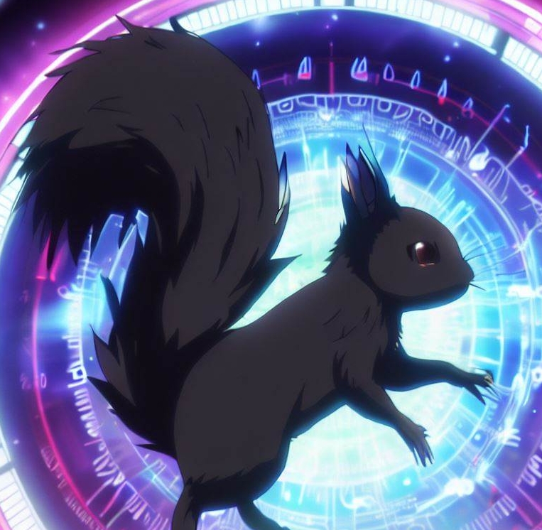
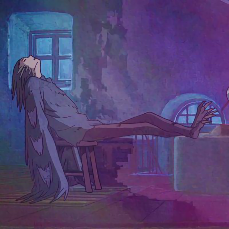
What kind of weird grunge art splash screen is that? For an art program splash screens typically represent what can be made in the software. If I saw something that ugly by the devs of an art app I’d run.
Typical of the open source world. Full of programmers. Barely any designers/artists.
I told my coworker that GIMP was named in reference to Pulp Fiction. I ought to send this to him as proof.
Porn sure seems a lot tamer than it did last time I saw any
I’m gonna need some context on this one.
This was used at the splash screen for dev builds in 2011 and was never shown on a release build. The dev splash screens have always been a bit memey.
Added: https://github.com/GNOME/gimp/commit/eb0591f97dca152ec827db083f910b6a9ea16369
Removed: https://github.com/GNOME/gimp/commit/5b4db22ae1b3d3c9aa7a91cb64e29e4f1b15ed18That’s a really neat bit of history. I wish I knew about this sooner, some of those look really cool. Thanks.
The name of the program is part of the context.
I uninstalled Kira because of the splash screen.
Hah, they really should bring this back! 😆
