I propose a new standardization:
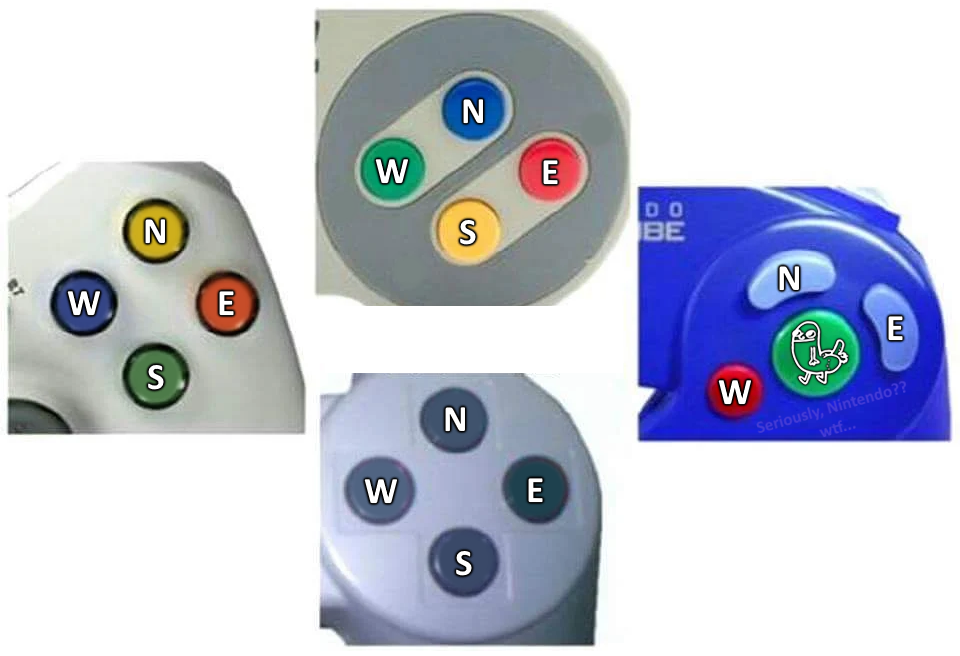
Press the dickbutton!
If Nintendo 64 had a Dickbutton, it would be at the tip of the middle handle, and the Z button would be balls.
If I had a dollar for every time someone said that to me…
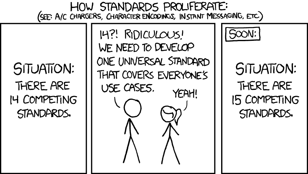
All in favour?
Aye
That’s actually quite a good idea; press “West” will take a bit to get used to but easy nonetheless.
Every controler and keyboard should come with a dickbutt button.
A dickbutton if you will
North East West South, or NEWS for short.
Biggest annoyance for me is how on playstation and Xbox the bottom button makes is the “okay” or “enter” button and the right button is “back” but on the switch it’s reversed so when I click the bottom button to select something in a menu I back out of it instead.
Worse than that, on the psp if you play japanese games that are not localised to english, the circle becomes the okay button, but in the rest of the os, the x is the okay button so you have to mentally switch.
Genshin Impact had that problem on launch. After a few months they added a setting to reverse (fix, in American terms) the OK and Cancel buttons on controllers. It was especially bad on XBox controllers on PC, as originally the green button was cancel and the red one was OK.
That is why I use a third party controller that allows me to remap buttons.
8BitDo Pro 2
I can use it for the PC, Switch, Xbox, or PlayStation.
remapping is super useful, but the problem I have are when prompts on the screen relate the button letter, color, and orientation all together like how they’d be on the controller it expects.
used to use my switch controller on pc, but games like Guardians of the Galaxy messed my brain up when it asks for, within a given timeframe, the overwhelmingly green, enormously-typefaced ‘A’ button that’s on the bottom of the 4 face buttons; I’m used to switching mindsets between controllers, not mixing them together, so ended up switching over to an xbox-style controller for pc
and I didn’t downvote, but thought to chime in maybe from a perspective of someone else that throws them around more nonchalantly; it’s either a thought like that, or they personally had bad experiences with the pro 2
Yeah, that does give me issues too. I’ve setup my controller as as Xbox controller also. When the Switch shows to press the “A” button (At 3:00 o’clock), I try to not look at the placement, but the letter, which would be my 6:00 o’clock.
Idk why everyone hated that comment but I think it’s smart
I am currently going between Zelda and a couple games on PS5 and this is driving me nuts! Total first world problems but I will continue shaking my fist in the air.
For the exact same reason, I switched those two buttons on the switch. That’s a pretty neat feature. Except when I alternate playing with the kids who got used to the switch default buttons, I need to remap everytime but you can save and load mappings.
In Zelda you can also change the mapping, which I did so that I could run with one button (bottom one if I recall) and jump with the button next to it (right I think) instead of the top one, because it’s way easier to run and jump by simply rolling your thumb.
Damn I didn’t know you could do that. I just beat it yesterday.
That is why I use a third party controller that allows me to remap buttons.
8BitDo Pro 2
I can use it for the PC, Switch, Xbox, or PlayStation.
Technically Xbox and Playstation are the ones that are reversed. Nintendo’s scheme came first and follows right=forward left=back. Then when the PlayStation came out Sony followed the same scheme in Japan, but picked a symbol that was perceived in opposite ways in Japan and the rest of the world for accepting something (⭕), so they inverted the scheme for most of the world. And then Microsoft mixed Nintendo’s letter semantics with Sony’s button position, creating the current mess.
IIRC on the PS2 and earlier triangle was usually back. Just an extra little dash of inconsistency to ruin your day.
Circle was traditionally used for the Back button as well.
And on my PSP it changed one day with a software update from triangle to circle for back.
That was very confusing.
Its a old japan thing from what I remember . On older Japanese ps1 games circle was ok and X was back . And even if you get a Japanese ps vita it’s like that too. Not sure about other sony consoles.
So aggravating.
I played Sniper Elite 5 on my fiances Xbox the other day and hadn’t played games in forever. (34 years old now) I knew I could remap the buttons if needed, but the melee button they made Y. I pressed down the right stick every damn time as a built in reaction from years back.
I don’t know why I felt I needed to say that, but I tell you when you find yourself looking through binoculars and getting lit up at point blank range it reminded me how frustrating games can get during quick scenarios.
Final Fantasy II on the SNES trained me that right button = okay and bottom button = back. I just got used to switching back and forth when the PS1 came out.
Especially wack considering two of those controllers are from the same company
You forgot this

My brain naturally translates this.
Example: emulating PS2 games using a Xbox controller.
Yeah, when you play enough it’s just like being fluent in multiple languages.
My friends hated playing gamecube games on an emulator with me using Xbox 360 controllers because I would always respond what the button was on a GameCube controller. PRESS B, I AM… oh I mean X.
Just how old is this meme?
IDK but I am sure that it is pretty old. Still funny though.
At least X is always blue…
Purple on SNES…
Everything was purple on the North American SNES lol
except X and Y which are Lavender.
That’s just the US version, everywhere else (I believe) has the one you see in the top picture here.
Even then he is still wrong. X and Y were baby blue and B and A were purple.
Nintendo and Xbox are the most confusing, as if my dyslexia didn’t suck already.
The SNES trained me that X = top button, but I use PS controllers enough that it’s not a problem switching. Xbox button prompts have always messed me up, though. Those labels are wrong!
Are you my alt? lol
Fun trivia about the Xbox controller is that their design is heavily influenced by Sega’s. The Xbox controller has the same face button layout as the Dreamcast’s. And if you compare the Duke (original fat) controller to a Saturn/Genesis/Mega Drive 6-button controller, you can think of those black and white buttons as the former C and Z buttons.
Some consider the OG Xbox as a successor to the Dreamcast.
Might be possible that they were using dreamcast controllers during initial development:
Previously, Sega had developed a version of Windows CE for its Dreamcast console to be used by game developers.
https://en.wikipedia.org/wiki/Xbox_(console)#Creation_and_development
Gates was in talks with Sega’s late chairman Isao Okawa about the possibility of Xbox compatibility with Dreamcast games, but negotiations fell apart over whether the Dreamcast’s SegaNet online service should be implemented.
https://en.wikipedia.org/wiki/Xbox_(console)#Initial_announcement_and_content_acquisitions
We especially said that when Xbox got Shenmue 2 in the states
Just use a PC, where “act on thing” can be one of 57 possible letters and/or combinations.
Press ctrl+shift+alt+Num0 to pay respect
When a console game finally releases a PC port and the title screen still says “Press Start,” you know the keys are going to be completely unhinged like, “I” to open your inventory. “C” is yes, and “V” is no, except in the escape menu, where “Enter” is yes and “Backspace” is extra-yes. Left-click to either attack or walk forward, depending on how your character is feeling.
Still presses F when it’s bound to E
I can’t ever help troubleshoot control issues on Minecraft because I remap everything to be sensible inputs (who the flip thought sprint should be CTRL?!)
Sprint on q for you, too?
It’s usually E or F, at least. Except when it’s space. Or tab. Wait, I’ve seen C, Z, and X before, too.
Seriously PC devs, get your shit together. What’s even worse is when the sequel changes the keys with no discernible reason, so I can play the games back to back only to have the hardest time.
Proposal: make the X button look like this: 🥚
Problem solved
Take good care of Paul 🥚
THE PASSWORD IS ON FIRE PUT IT OUT
Ok
But then it might get mixed up with the ⭕ button.
In that case, add a face on it
How will we get enough chickens, though?
By replacing the triangle button with those
I propose we colour code it
This has only ever fucked me up with a recent game because they use the colors of a PlayStation controller (which I am using) but the buttons are for Xbox. So when it said I needed to press X to finalize my character at creation, I kept pressing X and nothing was happening.
I have such a hard time understanding why not everyone loved the game cube layout the most tbh
